From scattered spreadsheets to one agile KPI dashboard
How AI-assisted prototyping turned fragmented Jira, Excel and Forms reporting into a working dashboard with a secure path to on-premise data.
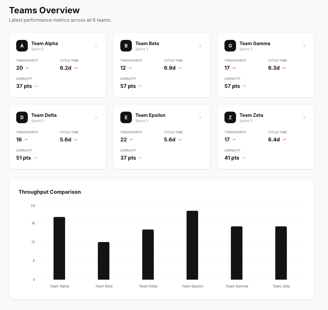
The organisation had plenty of delivery data and very little shared transparency.
The source material was spread across an old on-premise Jira instance, Excel files and Microsoft Forms. Teams used different templates and sometimes different interpretations of the same KPI. Creating an overall view meant collecting, copying and reconciling figures by hand. By the time a report was ready, parts of it were already outdated.
I wanted one consistent view of how the agile and SAFe teams were developing over time, without introducing another reporting ritual.
An unbelievably fast prototype
The speed of the first working version surprised me. With AI supporting the implementation, I could describe the next outcome, inspect the generated React and TypeScript, run it and correct it immediately. The feedback loop often took minutes rather than the long setup cycles I was used to.
The team overview, detailed sprint view, archive, configuration and report wizard emerged through these short iterations. AI handled a large part of the scaffolding and repetitive interface work. I remained responsible for the product decisions: which metrics belonged together, how trends should be interpreted, what the data model needed and where the security boundary had to sit.
That distinction mattered. Fast generation made more experiments affordable, but every result still needed review. The AgileMetrics source code on GitHub makes the implementation visible instead of hiding it behind the prototype.
What the dashboard shows
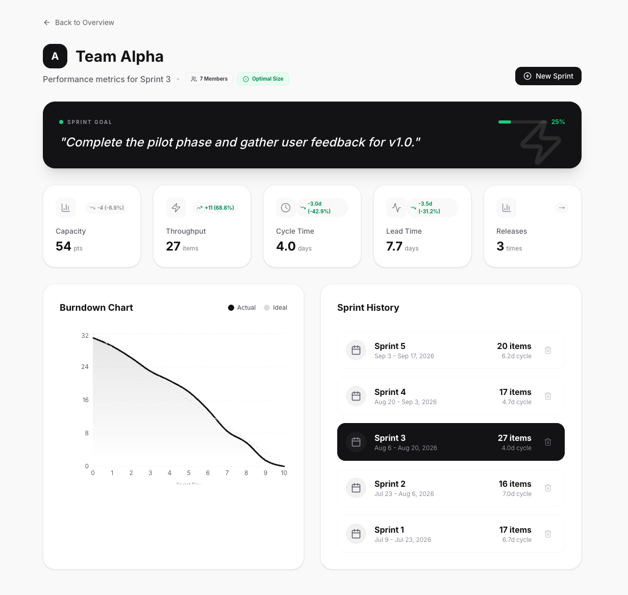
The overview brings the latest throughput, cycle time and capacity together for all teams. Trend indicators compare the current sprint with its predecessor. Opening a team adds the Sprint Goal and its completion, lead time, release frequency, burndown and sprint history.
The stack is deliberately compact:
- React 19, TypeScript and Tailwind CSS 4 for the responsive application.
- Recharts, Motion and Lucide React for visualisation and interaction.
- Node.js and Express for the REST API.
- Better-SQLite3 for local team and sprint history.
- Vite for development and production builds.
The public version contains demonstration data and a report wizard, so the application can be explored without internal company data. The production concept connects the same data model to Jira.
Connecting Jira without opening Jira
A direct browser connection to the old on-premise Jira instance would have introduced unnecessary security risk. It could have required new inbound access, broad API permissions or credentials in places where they did not belong.
Instead, ScriptRunner operates inside Jira after a sprint has been completed successfully. It selects only the approved fields, prepares the required KPI values and creates a defined JSON snapshot. That snapshot maps to the dashboard’s sprint model and can be stored through the application’s API.
The boundary is simple and reviewable:
- No Jira credentials or administrative tokens reach the browser.
- Jira needs no public inbound connection from the dashboard.
- The export contains only the data required for reporting.
- Descriptions, comments and unnecessary personal data remain in Jira.
- Every completed sprint creates a stable historical record instead of a changing live query.
The JSON file still requires an approved storage location, access controls and a retention policy. Its value is that the organisation can see exactly what crosses the boundary.
What changed
The dashboard replaced several competing reporting views with one shared language. KPI definitions became repeatable, and every figure could be connected to a specific sprint report.
It also reduced manual work. Teams no longer had to recreate the same report in another spreadsheet. Reporting time could be used to discuss patterns instead of checking formulas and copied values.
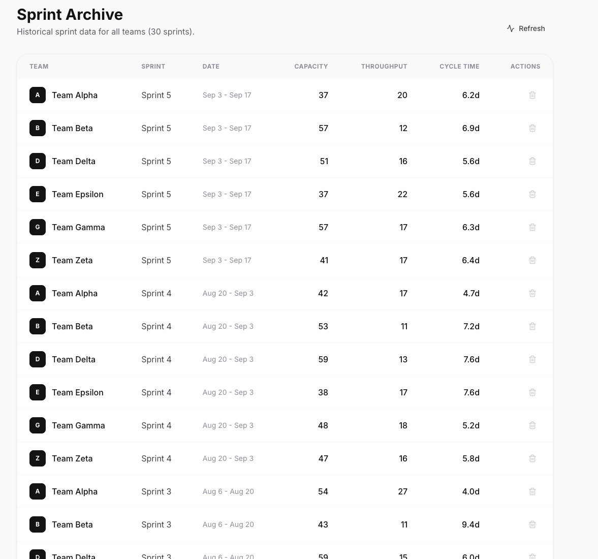
The historical view made trends easier to recognise. One difficult sprint may be noise. Repeated changes in throughput, cycle time or Sprint Goal completion deserve a closer look. If several teams show the same pattern, the cause may sit in dependencies, shared platforms or decision paths rather than inside one team.
Most importantly, the dashboard creates transparency without pretending that one number can measure agility. It is a conversation tool for teams, Product Owners, Scrum Masters and leaders. The value begins when a visible pattern leads to a better question, a decision or an experiment.
AI made the prototype unbelievably fast. The useful product came from combining that speed with clear metric definitions, technical review and a security-conscious integration into the environment that already existed.
The part that never made it to production
The dashboard never made it into production. The reason is simple: it was too fast, too good and would have had too much impact on a conservative, slow-moving German company. :)
The dashboard did not fail. It worked faster than the organisation was willing to change.
That is the deliberately provocative version. The more serious lesson is that a working product can challenge established reporting routines, ownership and decision paths faster than an organisation is ready to change them. The technical solution was viable. The organisation was not ready to adopt its implications.