About This Site
Why I turned a conventional résumé into a personal digital space, and used the project to rediscover an old design and explore a new web stack.
For years, my professional story lived in a carefully edited DIN A4 document full of roles, dates and qualifications. It did the job, but it never felt like me.
A CV explains what someone has done. It is weaker at showing how they think and how different experiences connect. My work spans agile delivery, product thinking, UX, frontend development and IT operations. I wanted a place that could show the connection as well as the person behind it.
A Portfolio for an Agile Coach?
Personal websites by Scrum Masters and Agile Coaches often follow a safe pattern: explain frameworks, list certificates, add a contact form. The work is harder to visualise than design or development. Workshop boards and velocity charts reveal activity, but rarely show judgement.
A designer can show an interface, and a developer can link to working code. A Scrum Master cannot take a screenshot of trust, clearer decisions or a team learning to solve its own problems. That made the execution of the portfolio part of the story.
I decided the site itself had to be the example. Its structure, language and interactions should show how I connect people, products and technology, giving an abstract profession a clearer voice and a memorable shape.
A portfolio should not describe how I think. It should prove it in every decision.
The Design Was Already Waiting
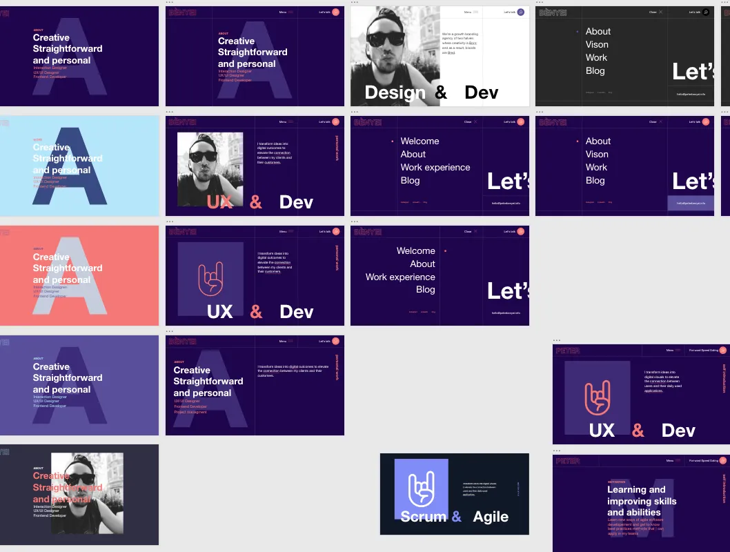
I did not begin with a finished message. Then I found an old Adobe XD concept I had designed years earlier and never shipped.
The open navigation from the earlier portfolio concept. Its grid, scale and dark visual language became the foundation for this site.
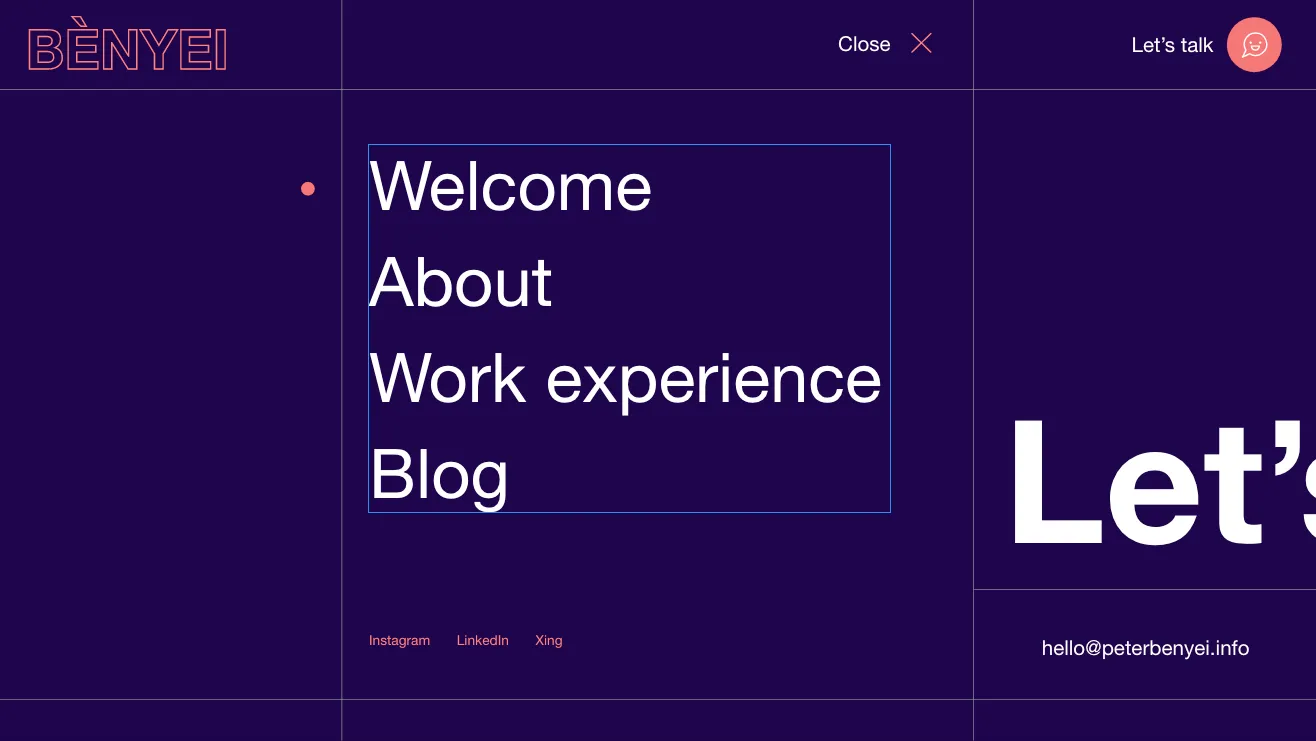
The concept came from a stage when UX and development led my story, but its dark canvas, strict grid, oversized typography and hand symbol still felt right. I kept that character and evolved the message around agile delivery, team enablement and ownership. The identity did not need to be invented. It needed to catch up with who I had become.
I did not reproduce the old design pixel for pixel. I treated it like a product with a valuable core: preserve what still works, remove what no longer fits, and let the current purpose guide every new decision.
Returning to the JAMstack
The project let me return to the JAMstack with a newer generation of tools. I have worked with powerful content-management systems and know why organisations need them. I also know the machinery they bring: databases, server rendering, plugins, updates and configuration. A personal site does not need most of it.
With the JAMstack, content and components live in the repository, pages are built ahead of time, and the result is mostly static files. JavaScript and external services are added deliberately. That means less operational complexity, strong caching and a smaller attack surface.
I had previously used Gatsby and Bootstrap. This time I wanted to question those defaults and see how much the workflow had improved.
Why Astro
Astro fits because this website is primarily content. It sends static HTML for most pages and treats JavaScript as a deliberate addition. Navigation, transitions and the interactive agile loop need behaviour. Articles, career history and services do not need a client-side application to exist.
Astro components keep the system modular, while its islands approach limits client-side code to the places where interaction earns its cost. The page remains useful before an animation or script begins.
The blog uses Markdown in an Astro content collection. One source feeds article pages, categories, tags, the RSS feed and the homepage. A schema validates the metadata, while writing remains separate from layout. No database or administration interface is required.
Tailwind for the System, GSAP for the Moments
Tailwind CSS suited a visual system built from recurring spacing, borders, typography, grid proportions and a small palette. Shared CSS tokens keep those decisions consistent, while utility classes make responsive iteration fast.
The old Adobe XD grid translated into responsive rules that I could test at different widths and refine without building a collection of one-off component styles.
GSAP adds motion where it supports the site’s personality: the hero sequence, logo, timeline and transitions. The goal is rhythm and surprise without putting friction between the visitor and the content.
From VS Code to Production
The source lives on GitHub. IONOS Deploy Now turns each production push into a repeatable build and deployment. The workflow is simple: change, review, commit and let the pipeline publish it.
I built the site in VS Code with Codex beside me. It accelerated components, styling and debugging. Its value was not replacing decisions. It shortened the distance between an idea and something I could inspect in the browser. That felt like good product work: I set direction and constraints, then used fast feedback to improve the result.
A First Release, Not a Final Answer
The content plan and brand message emerged through the work. I wrote a section, saw it in context, noticed what felt wrong and tried again. The result is more than a digital CV, but it is still a first release.
The fastest way to clarify an idea is to make it real enough to disagree with.
Now the site can do what a document could not: make an abstract profession tangible, connect my agile work with my technical background and keep evolving through real feedback.